Polar Rose Chart
|
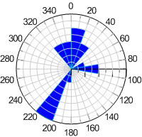
Click the Home | New Graph | Polar | Polar Rose Chart command to display data in groups or bins, similar to histograms. Each bin represents the number of occurrences of an event that fall within a specific angular region, defined by the bin size. Click the Polar Rose Chart button to create a polar rose diagram. |
|

|
| Rose charts show binned data similar to histograms. |
Creating a New Polar Rose Chart
To create a rose chart:
- Click the Home | New Graph | Polar | Polar Rose Chart command
- Select a data file in the Open Worksheet dialog. You can select a new data file or you can select an open data file in the Open worksheets section.
- Click the Open button. A rose chart is created using the default properties.
Editing Polar Rose Chart Properties
To change the features of a rose diagram, including the column used to create the diagram, first select the diagram in the plot window or Object Manager and then edit its properties in the Property Manager. Click the following tabs in the Property Manager to change different properties:
