Data Limits Properties
Data limits are common properties that are used to limit data in many types of plots in Grapher. Data can be limited by Worksheet rows, Clipping, Data Filter, Plot Interval, and Value Limits. Select the plot you wish to limit and click the Data Limits tab in the Property Manager to edit the data limits properties. The data limits properties available will be specific to the type of plot.
|
|
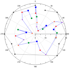
|
Example Data Limits properties page using the 3D bar chart.dat sample file. |
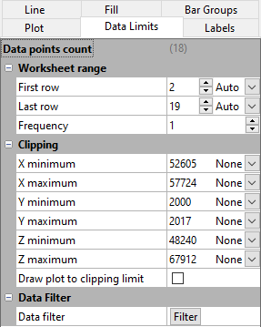
Data Points Count
The total number of data points used in the plot appears next to the Data points count field. This value changes as the First row, Last row, and Frequency changes. This value is informational and cannot be changed directly.
Worksheet Range
Select the data range to plot in the Worksheet range section. The default data range includes the first and last rows/columns in the worksheet that contain data. If Data in rows is selected on the Plot page, the worksheet range is specified by column rather than row.
If Auto is selected for the First row and Last row, all of the rows containing data are used. Click the word Custom and select Auto to go back to automatic row selection. The word Auto will appear and the First row or Last row will revert to the default row.
To limit the range of the plotted data, you can change the range of rows. Type a new row number into either the First row and Last row boxes. The Auto selection will automatically update to Custom.
Use the Frequency to skip rows of data in the plot. For example, if Frequency is set to 5, every fifth data value between the First row and Last row is plotted on the plot. When Frequency is set to 1, every data value between the First row and Last row is displayed.
By default the Frequency value is set to 1 for newly created plots. However if the Data points count would exceed the Threshold for thinned plots specified in the Options dialog, the default Frequency value will be increased until the Data points count is less than the Threshold for thinned plots. Set the Frequency to 1 to remove the plot thinning. You can disable the automatic plot thinning in the Options dialog Environment | Plots page.
Stiff Plot Worksheet Rows
The worksheet rows are specified for the left side and right side of a stiff plot independently in the Left rows and Right rows sections.
Clipping
The Clipping section sets the limits of the data displayed on the graph. Plots can be clipped to the axis limits or to custom values. When a plot is clipped, the plot is not drawn outside a specific range of values. At least one data point must be within the clipping limits for Grapher to draw the plot. If a custom value is set to a number that is less than the minimum data value or greater than the maximum value, data is displayed.
The default value for the X, Y and Z minimum and maximum clipping is set to None, and the initial numeric values are the minimum and maximum values in the selected data. In the example Data Limits properties image above, you can see that the X minimum for the sample data set is 52605, and, because None is selected, no data clipping is applied.
- Select None to accept the full data range.
- Select Axis to clip the data to the axis limits. If the plot is displaying more data than desired, change the Axis limits on the Axis tab.
- Select Custom to limit the plot to a specific range and enter a new value.
NOTE: Setting the clipping limits to Axis is useful for quickly viewing a section of the plot by changing the Axis limits. Setting the clipping limits to None always displays the entire plot, regardless of the axis limits. Setting the clipping limits to a custom value can be useful for removing unwanted data from the plot.
Custom Date/Time Values
If you have used date/time formatted values to create a graph, date/time tick labels are automatically enabled for that axis. If you select Custom for the X minimum, X maximum, Y minimum, Y maximum, Z minimum, or Z maximum options, you can set the clipping range by dates or time. For example, if date/time data are used for the X values of a plot, X minimum date/time and X maximum date/time fields are available. Click the current date/time value next to X minimum date/time and X maximum date/time to open the Select Date/Time dialog. Set a new date and time and click OK to return to the Property Manager. Alternatively, highlight the date/time value next to X minimum date/time or X maximum date/time and type the desired date or time value. Press ENTER on the keyboard to update the plot. When inputting date/time values directly in the Property Manager, date/times must always be entered as MM/dd/yyyy hh:mm:ss. No other formats are permitted in the date/time edit boxes in the Property Manager.
Draw Plot to Clipping Limit
When a plot is clipped, the lines in the plot are drawn connecting the visible data. When the Draw plot to clipping limit box is checked, the shape of the line reflects data outside the clipping limits and the line is drawn to the extents of the clipping limits. For example, if you clip a line/scatter plot to a minimum of 100 and a maximum of 300, but the data appear at a minimum of 125 and a maximum of 255 within these limits, the line is limited to 125 to 255. Check the Draw plot to clipping limit box to draw a line to the extents of the clipping limits, in this case, 100 to 300.
|
|
|
|
|
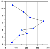
The original plot is shown without clipping. |
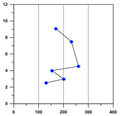
The X axis clipping is set to a range of 100 to 300. The X axis range is 0 to 400. The Draw plot to clipping limits option is not checked. The line is drawn between the visible, unclipped points, as if the clipped points did not exist in the data table. |
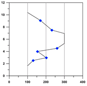
The X axis clipping is set to a range of 100 to 300. The X axis range is 0 to 400. The Draw plot to clipping limits option is checked. The line extends to 100 and 300. The shape of the line changes to reflect outlying clipped points. |
For a bar chart, if the Draw plot to clipping limit is checked, the bar is displayed extending to the clipping value. If the box next to Draw plot to clipping limit is not checked, the bar is removed from the plot.
|
|
|
|
|
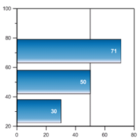
This bar chart displays all of the bars without any clipping. The label displays the X value being plotted in all these bar charts. |
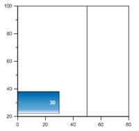
This bar chart is clipped to a maximum X value of 49. The Draw plot to clipping limit is not checked, so the clipped bars are completely removed. |
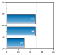
This bar chart is clipped to a maximum X value of 49. The Draw plot to clipping limit is checked, so the clipped bars are displayed to the clipping value. |
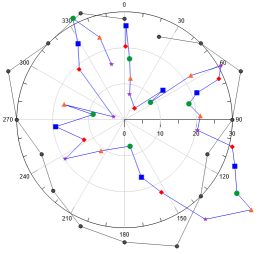
Clip to polar circle
For polar plots, when the Clip to polar circle box is checked, points outside the Angle axis are not drawn. These points are completely removed from the polar plot. When the Clip to polar circle command is not checked, the plot can extend beyond the Angle axis. If the chart bin value is greater than the axis maximum, the chart will be drawn to the axis maximum and stop. To display the entire bin, set the radius axis maximum value to Automatic.
Data Filter
Click the Filter button in the Data Filter section to open the Data Filter dialog to specific criteria for excluding data from a plot. Data filtering is a common feature of most plots, see the Data Filter help topic.
Fit Plot Interval
When the plot contains a fit curve, the Plot Interval section controls the limits of the fit curve. The Plot interval can extend the fit curve beyond the data limits of the original plot. The Plot Interval section only controls the values where the fit curve is displayed and does not change which data is fitted. To create the fit curve from only a subset of the plot data, use Fitted Plot properties on the fit curve Plot page.
Plot Limits
The Plot limits option sets how the limits for the fit curve are chosen. The Fitted data limits option uses the Minimum value and Maximum value from the Plot page Fitted plot section for the Minimum plot value to fit and Maximum plot value to fit values. The Axis limits option extends the fit plot to the entire axis range. When the axis limits are changed, the fit curve is automatically changed to fit the new axis limits. The Custom option allows custom values to be set for the First X and Last X values. To change the Plot limits, click on the current option. Select the new option from the list and the plot will automatically update.
If the custom fit range is greater than the axis limits and the axis is set to use automatic limits, the axis range changes to match the customized limits. If the axis limits are set to custom limits, the fit curve can exceed the axis area if the First X or Last X value is outside the axis range.
The running average, weighted average, and spline smoothing fits do not extrapolate the fit beyond the data. Regardless of the values in the Plot interval section, the fit curve will not plot beyond the original plot's X range.
Function Value Limits
Specify the function interval, or range of the variable, in the Value Limits section. The First value and Last value properties specify the beginning and end of the function plot. Enter the first value for the independent variable into the First value box. Enter the last value for the independent variable into the Last value box.
Number of Points and Increment
The Number of points determines how many times the equation is calculated. This determines the number of plotted data points. A larger number of points means more detail is plotted in the function. However, the larger the number of points, the longer it will take to graph the function. When the Number of points is changed, the Increment value is automatically updated. The Increment value shows the difference in the independent variable (X, Y, A, or T depending on function Type) values between adjacent points on the graph. When the Increment value is changed, the Number of points is automatically updated. The Number of points cannot exceed 1000.
Grid Rows
Select the number next to First row to change the number of the first row to be used in the map. Select the number next to Last row to change the number of the last row to be used in the map. These values cannot exceed the number of rows in the grid file.
If Auto is selected for the First row and Last row, all of the rows containing data are used. To limit the range of the plotted data, you can change the range of rows by selecting Custom. You can then enter a new row number into the First row and Last row boxes. Click the word Custom and select Auto to go back to automatic row selection, and revert to the default row.
Select the number next to First column to change the number of the first column to be used in the map. Select the number next to Last column to change the number of the last column to be used in the map. These values cannot exceed the number of columns used in the grid file.
If Auto is selected for the First column and Last column, all of the columns containing data are used. To limit the range of the plotted data, you can change the range of columns. Next to First column or Last column, select Custom and enter a new column number into either the First column and Last column boxes. Click the word Custom to go back to automatic column selection.