Piper Plot and Piper Class Scatter Plot
|
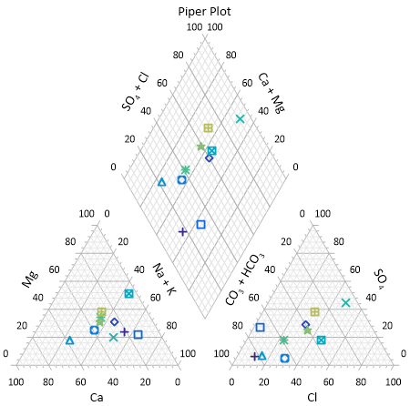
Click the Home | New Graph | Ternary | Piper Plot command to create a piper, or trilinear, diagram. Click the Home | New Graph | Ternary | Piper Class Scatter Plot command to create a piper diagram with classed symbols. A piper plot is one way of visualizing the chemistry of a rock, soil, or water sample. A piper diagram shows the percentages of six ion groups in two ternary plots and a diamond plot. A ternary diagram in the lower left represents the cations: calcium, sodium + potassium, and magnesium. A ternary diagram in the lower right represents the anions: chloride, carbonate + bicarbonate, and sulfate. A diamond plot is a matrix transformation of the cation and anion ternary plots. Click the Piper Plot or Piper Class Scatter Plot button to create a piper diagram. |
|
To plot data on a piper diagram, the sum of the three cationic data points (X + Y + Z) and the sum of the three anionic data points must each equal 100 percent. If the sum does not equal 100 percent you should normalize your data so that it meets this requirement, otherwise Grapher normalizes the data when it is plotted. Once this relationship has been established between the data points, you need only know the values of any two data points in order to determine the third. Reading a point on a ternary diagrams can be done by looking at the location of each point as it relates to the three axes.
You can add a line connecting the points within each ternary diagram and in the diamond plot. The line connects the data in the order it appears in the data file. When a line is added to one of the component plots in the piper diagram, a line is added to the other plots as well. To add a line, select the Anion ternary plot, Cation ternary plot, or Diamond ternary plot, open the Line tab in the Property Manager, and then select a line style other than Invisible. A line is displayed in all three plots.
When creating a piper plot, Grapher assigns the data file columns in the following order: cation X, cation Y, cation Z, anion X, anion Y, anion Z, and class (if applicable). If your data is ordered differently, select the appropriate columns by selecting the Anion or Cation ternary plot and specifying columns in the Property Manager Plot page.
|
|
|
Piper plots show the ionic concentrations in water, soil, or rock chemical samples. |
Creating a New Piper Plot
The following steps demonstrate how to create a piper diagram:
- Click the Home | New Graph | Ternary | Piper Plot or Home | New Graph | Ternary | Piper Class Scatter Plot command.
- Select the data file in the Open Worksheet dialog. Select a new data file, or select a file that is already open in the Open worksheets section of the dialog.
- Click Open to create the piper plot.
Editing Piper Plot Properties
To change the features of a piper diagram, including the columns used to create the diagram, open properties by selecting the anion ternary plot, cation ternary plot, or diamond plot and editing the properties in the Property Manager.
Label properties are edited independently for the anion, cation, and diamond plots in the piper diagram. However, label properties can be applied to the piper diagram components at the same time by selecting the anion, cation, and diamond plots and editing the similar properties in the Property Manager.
The Worksheet, Class column, data limits, symbol, and line properties are shared between the cation, anion, and diamond plots. The property is changed for all plots when the property is changed for any one plot. The anion and cation plots have Data Limits Properties properties for clipping and setting a data filter.
The separation distance between the anion, cation, and diamond plots is specified on the Graph page.
Click the following tabs in the Property Manager to change different properties: