Plot Page - Polar Bar Charts
The polar bar chart plot properties Plot page contains the options to change the data file and columns; add a new plot to the graph; and set bar chart properties. To view and edit bar chart plot properties, click on the bar chart plot in the plot window or Object Manager to select it. Then, click on the Plot page in the Property Manager.
|
|
|
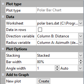
The polar bar chart properties are edited in the Property Manager on the Plot page |
Plot Type
The Plot type property displays the type of plot.
Worksheet
Click the existing data file path and file name next to Worksheet to select a different data file for the plot. Click on a currently open worksheet or click the Browse option to navigate to a worksheet that is not yet open. Select a different data file in the Open Worksheet dialog, and click the Open button to change the data. The plot automatically updates.
NOTE: The worksheet columns are retained after changing the worksheet. If any of the column options are blank after changing the Worksheet, click on the blank option and select the desired column. A blank next to column means that the column does not exist in the new worksheet.
Data in Rows
Select the Data in rows option if your data file is formatted where each row includes one variable. When the Data in rows option is selected, all plot properties that require data values are specified by selecting a data row. This includes variables such as X and Y, data labels, worksheet ranges, etc. Properties that list column letters will update to list row numbers. When switching from plotting data in columns to plotting data in rows, Grapher may not be able to select the correct rows automatically. Verify the correct rows are selected.
The property descriptions below refer to data columns, but when Data in rows is selected the property lists will include rows.
Data
Click on the column name next to the Direction variable, and Radius variable properties to change the data used to create the plot. In the list that appears, select the new column. If the first worksheet row contains header information, the header information appears next to the column letter.
Aside from the columns containing data there are two other options, row number and sequence number. These options are available in the list that appears before the first column.
-
Selecting the Row number option plots the axis with the row numbers used in the Worksheet rows section. For example, if the first row is number two, the axis begins at a value of two.
-
The Sequence number option plots the data according to the total number of rows used. The sequence number always begins with the number one regardless of which rows are selected in the Worksheet rows group. Blank lines between rows are ignored when calculating the value. The sequence number increments by one when rows are adjacent or when rows are skipped.
When changing the Direction variable or Radius variable to date/time data from numeric data, the Use date/time format option for the corresponding axis Tick Labels will automatically be checked to match the new data. When changing data to a numeric column from date/time data, the Use date/time format option for the corresponding axis Tick Labels will automatically be unchecked to match the new data.
NOTE: The worksheet columns are retained after changing the worksheet. If any of the column options are blank after changing the Worksheet, click on the blank option and select the desired column. A blank next to column means that the column does not exist in the new worksheet.
Plotting Multiple Variables
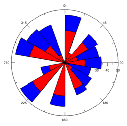
If multiple variables are plotted, the bars can be stacked or adjacent. Change the Stacking option to either Stacked or Adjacent. This setting affects all polar bar charts in a single bar chart group when multiple bar charts are plotted on one graph. To change the Stacking option, click on the existing option. In the list, select the new option.
|
|
|
|
These bars are stacked. The second bar is placed starting at the top of the first bar. |
These bars are adjacent. The bars are located side by side. |
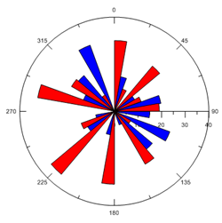
Adjacent
The Adjacent option draws variables as a group of bars. The group of bars for each Angle value are centered on the Angle value data value.
Stacked
The Stacked option draws all the variables one on top of the other. The base for additional variables are the ends of the previous variables. The total height of a stacked bar is the sum of all variables (Radius values) for each Angle value.
For example, there are three variables with the Radius values 10, 15, and 20. The first bar would be drawn from zero to 10. The next bar would be drawn from 10 to 25, and the final bar would be drawn from 25 to 45.
Angle Width
The Angle width option sets the width of the polar bars. When the Angle width is set to Auto, the angle width is automatically calculated to fill the entire polar plot area. The wedges are adjusted to ensure that the start point of each wedge is always in the center of the plot. The Angle width is set in degrees and must be a value between 0.1 and 90 degrees. To return the value to the default, click the word Custom . It will automatically change to Auto and return the value to the default.
Bar Width
The Bar width field controls all of the bars in the graph in the same bar chart group. Set the width of the bars from 1 to 50000 percent. The default width is 80 percent. The 100 percent width is determined by the range of the X values. When the Bar width is set to 100 percent, the bars touch and cover 100 percent of the data range. When the Bar width is set to 50 percent, the bars cover 50 percent of the data range and there are gaps between the bars. When the width is set to a value greater than 100 percent the bars overlap. This setting affects all bar charts when multiple bar charts are plotted on one graph.
New Plot
Click the Create button next to the New plot command to create a new polar bar chart based on the current data file. A new chart is created using the same Angle column as the selected chart and the next column for the Radius variable. For example, if a selected bar chart uses column A for Angle values and column B for Radius values, clicking Create generates a new bar chart with column A for Angle values and column C for Radius values. The new chart is selected so you can change the new chart's properties.
The new polar bar chart is automatically added to the same bar chart group as the first bar chart. The line, fill, and/or symbol color automatically changes to a new color. The Plot palette option on the Options dialog Plots page controls the colors for plots added via the Create button in the Plot page.