Create a Line Plot
Line graphs are ideal for tracking changes over both short and long periods, and are better at detailed changes over time than bar graphs. In this lesson, we will create a Line plot illustrating temperature variance over time as shown below. To select a different plot type return to the graph selection page.
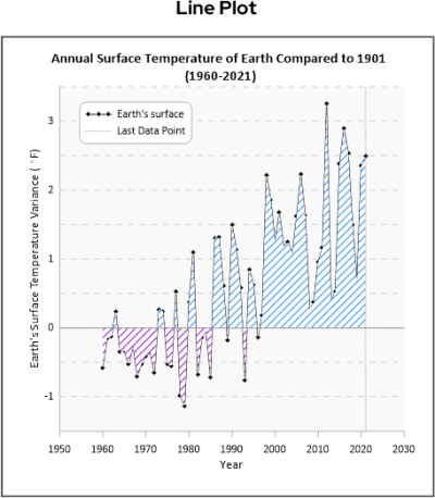
Line Plot
To create a line plot graph:
-
If needed click the Plot 1 tab to return to the new plot document.
-
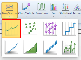
Click the Home | New Graph | Line/Scatter | Line Plot command.
-
Browse to the Samples directory at C:\Program Files\Golden Software\Grapher\Samples by default.
-
Click Open.
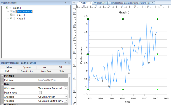
A line plot is created using the default properties. By default, Grapher uses the first two columns containing numeric or date/time data in the data file. In this example, the X values are in column A and the Y values are in column B.
|
| The line plot is created with the default settings. |
Change the line color and symbol properties
-
Click the current line plot to select it.
-
In the Property Manager, click the Line tab to select it.
-
In the Plot Line Properties section, click the Color field drop down and select Black from the color palette.
-
Click the Symbol tab in the Property Manager.
-
In the Plot Symbol Properties section, click the up arrow in the Frequency field to set it to 1, displaying a symbol at every data point.
-
In the Plot Symbol Properties section, click the Symbol field drop down and select the filled diamond (Symbol 6) from the symbol palette.
-
Click the + next to Fill to expand the section.
-
Click the Foreground color field drop down and select Black from the color palette.
Adjust the Y axis properties and title
-
In the Object Manager , click the Y axis, Y Axis 1.
-
In the Property Manager, click the Axis tab.
-
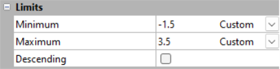
In the Limits section click the Minimum drop down and select Custom.
-
In the Limits section click the Maximum drop down and select Custom.
-
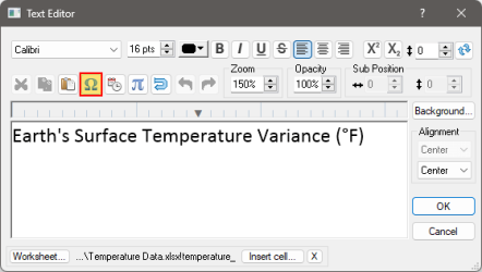
In the Title section, click the Text Editor button [
 ] in the Text field.
 -
In the Text Editor window delete the current text and enter "Earth's Surface Temperature Variance (F)".
-
To add the degree symbol place the cursor in front of the "F", then click the Insert Symbol button,
 .
.-
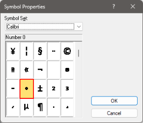
In the Symbol Properties window, click in the Symbol Set field and select Calibri from the list of fonts.
-
Scroll down 4 lines past the lower case z to find the degree symbol, select it then click OK.
-
Click OK to close the Text Editor window.
-
Golden Nugget : Graph and axes titles can use linked text so that the information is updated on the graph any time the information changes in the cell in the data file. Other linked text options include the file name, fit statistics, and date/time formats.
Adjust the X axis properties and title
-
In the Object Manager , click the X axis, X Axis 1.
-
In the Property Manager, click the Axis tab.
-
In the Limits section click the Minimum drop down and select Custom.
-
In the Limits section click the Maximum drop down and select Custom.

-
In the Title section, click the Text Editor button [
] in the Text field. -
In the Text Editor window delete the current text and enter "Year".
Change the Graph title
-
In the Object Manager, click the graph, Graph 1.
-
In the Property Manager, click the Title tab.
-
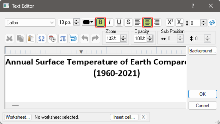
In the Title Properties section, next to the text field click the Text Editor button,
. -
In the Text Editor window delete the current text and enter "Annual Surface Temperature of Earth Compared to 1901 (1960-2021)".
-
To change the text formatting place the cursor in front of the "(" and press ENTER.
-
Select all of the text then press the Center Text and Bold buttons to change the font properties, then press OK.
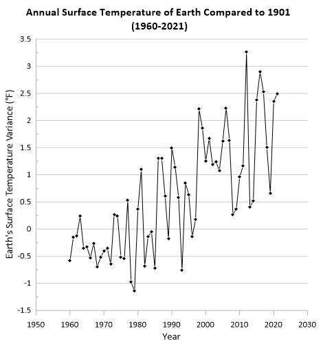
After completing the steps above your graph will look like the image below.
Now let's take this line plot and transform it into a stunning visual that is sure to make your data easier to understand and present to your stakeholders.
Let's start by adding some horizontal and vertical lines ....

|
|

|