Add Lines of Constant Value
Horizontal and vertical lines can visually highlight specific points along your X and Y axes. In this example, we will add a vertical line to indicate the last data point (2021) and a horizontal line to emphasize the baseline temperature of 1901 (0). Later, we will use this horizontal line to fill the area between it and the temperature data.
Add a vertical line
-
Click the current Line Plot to select it.
-
In the Object Manager click the
 next to the Graph.
 -
In the Select Plot Type window, select Function Plot - X = F(Y) and click OK.
-
In the Choose Axes dialog, click OK. The Choose Axes(link) dialog is used to select or create and position axes for a new plot to be drawn on.
-
In the Object Manager, click on the Function Plot to select it.
-
In the Property Manager, click the Plot tab.
-
In the Plot Options section, delete the current equation and enter 2021 in the X=F(Y)= field. Press ENTER to apply the change.
-
In the Property Manager, click the Data Limits tab.
-
In the Value Limits section, make sure the First value field is set to the Y minimum, -1.5 and the Last value field is set to the Y maximum, 3.5.
The line now extends the full length of the plot at the specified value, continue to change the line style and color.
-
In the Property Manager, click the Line tab.
-
In the Plot Line Properties section, click the drop down next to the Style field to change the line style and select Dots.
-
Click the drop down next to the Color field to change the line style and select Black.
-
In the Object Managerright click and select Rename Object... to rename the object.
-
In the Rename Object window enter "Last Data Point" in the ID box field, then click OK.
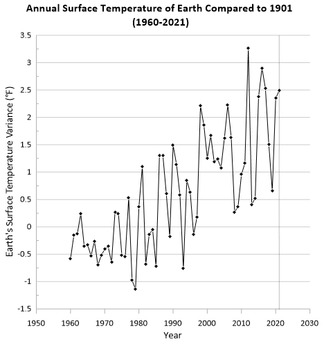
After completing the steps above your Line Plot will look like the image below.
Add a horizontal line
-
Click the current Line plot to select it.
-
Click the Graph Tools | Add to Graph | Plot | Function Plot - Y = F(X) command.
-
In the Choose Axes window click OK. This window allow you to select the graph and axes that you want to add the vertical line to, for this example the defaults work.
-
In the Object Manager, click on the Function Plot to select it.
-
In the Property Manager, click the Plot tab.
-
In the Plot Options section, delete the current equation and enter 0 in the Y = F(X) = field. Press ENTER to apply the change.
-
In the Property Manager, click the Data Limits tab.
-
In the Value Limits section, make sure the First value field is set to the X minimum, 1950 and the Last value field is set to the X maximum, 2030.
The line now extends the full length of the plot at the specified value, continue to change the line style and color.
-
In the Property Manager, click the Line tab.
-
In the Plot Line Properties section, click the drop down next to the Color field to change the line color and select 40% Black.
-
In the Object Manager select the Function Plot then press F2 to rename the object.
-
In the Rename Object window enter "Baseline Temp for 1901" in the ID box field, then click OK.
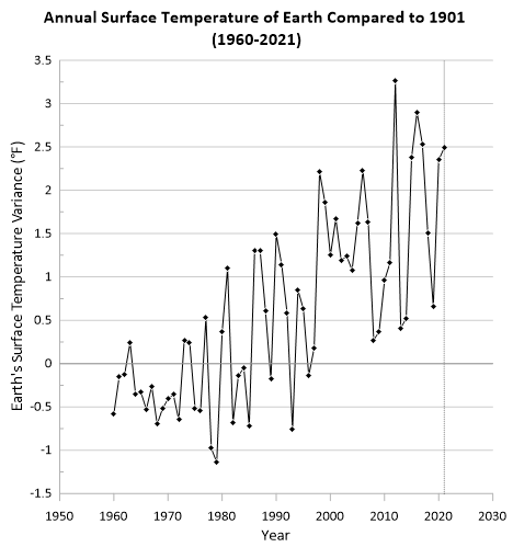
After completing the steps above your Line plot will look like the image below.
Now let's take this line plot and transform it into a stunning visual that is sure to make your data easier to understand and present to your stakeholders.

|
|

|