Elevate your Graph
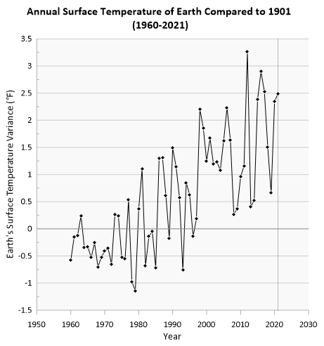
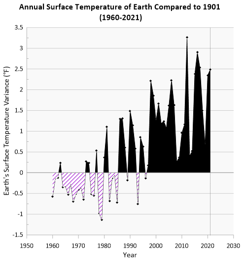
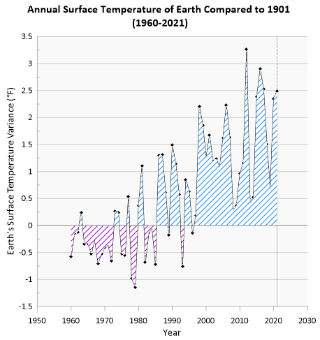
Now we'll elevate this line plot using color fills and a legend to make the graph more engaging and easier to interpret. A graph background can enhances visual appeal and clarity, helping to separate your data from the background. Filling the area between zero and your data highlights your data's magnitude and trends. While adding a legend clarifies the meaning of that data. All of these things make it easier for your audience to visualize and understand your data's story.
Graph background
-
In the Object Manager, click the graph, Graph 1.
-
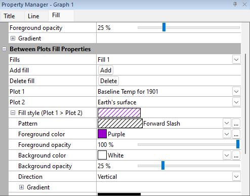
In the Property Manager, select the Fill tab.
-
In the Background Fill Properties section, click the drop down next to the Pattern field and select Solid.
-
In the Foreground color field, click the drop down and select 10% black.
-
In the Foreground opacity field, select the value 100% , input 25, and hit Enter change the background fill opacity.
Data fill colors
-
In the Between Plots Fill Properties section, in the Add fill field click the
 button.
 -
For the Plot 1 field, click the drop down and select Baseline Temp for 1901.
-
For the Plot 2 field, click the drop down and select Earth's Surface.
-
If needed click the
 button next to the Fill Style (Plot 1 > Plot 2) field to expand the section.
 -
In the Pattern field, click the drop down and select Forward Slash.
-
In the Foreground color field, click the drop down and select Purple.
-
In the Background color field, click the drop down and select White.
-
In the Background opacity field, delete the current text and enter 25, and press ENTER.
-
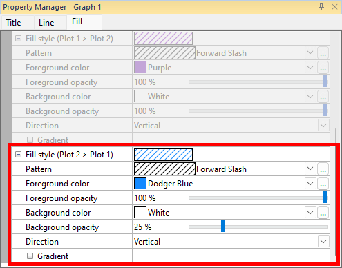
If needed click the
button next to the Fill Style (Plot 2 > Plot 1) field to expand the section. -
In the Pattern field, click the drop down and select Forward Slash.
-
In the Foreground color field, click the drop down and select Dodger Blue.
-
In the Background color field, click the drop down and select White.
-
In the Background opacity field, delete the current text and enter 25, and press ENTER.
Golden Nugget : You can add data labels to data points on most plot types in Grapher, showing values or info from another column. The label properties can be customized for placement, frequency, format, font, and color. Data labels can make it easy to see exact values and important data points at a glance.
Add the legend
-
Click Graph Tools | Add to Graph | Graph Legend.
-
In the Object Manager, select Graph Legend.
-
In the Property Manager, click the Entries tab.
-
In the All Entries section, next to the Reorder/select entries field click the
 button.
 -
In the Select Plots window, uncheck the box next to Baseline Temp for 1901, and click the OK button.
-
In the Property Manager, click the Title tab.
-
In the Title Properties section, next to the Text field, delete the text "Legend" and press ENTER.
-
In the Property Manager, click the Legend tab.
-
In the Frame section, next to the Frame field, click the drop down and select Rounded to change the corner style of the legend.
-
If desired, click the up arrow in the Number of columns field to make the legend entries display on a single row.
The final step in our graphing journey will be to share these results.

|
|

|