Create a Class Scatter Plot
If the Class Scatter plot below resembles what you would like to create, proceed; otherwise, return to the graph selection page. Scatter plots are useful for showing the correlation between two variables. They display data simultaneously on a horizontal x-axis and a vertical y-axis, making it easier to identify associations in your data. Class scatter plots allow you to visually group data sets to emphasize specific variables.
Line Plot
To create a Class Scatter Plot:
-
If needed click the Plot 1 tab to return to the new plot document.
-
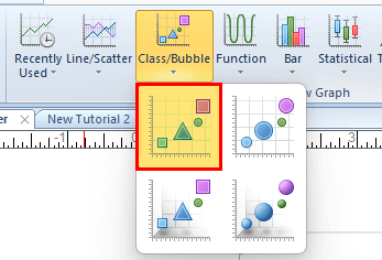
Click the Home | New Graph | Class Bubble | Class Scatter Plot command.
-
Browse to the Samples directory at C:\Program Files\Golden Software\Grapher\Samples by default.
-
Click Open.
A Class Scatter graph is created using the default properties. By default, Grapher uses the first two columns containing numeric or date/time data in the data file. In this example, the X values are in column A and the Y values are in column B. Grapher will also create a default class legend for you. Depending on how you have Grapher configured, you will see the Plot window, the Object Manager, and the Property Manager. Those two windows are described in more detail throughout the tutorial.
Golden Nugget : Grapher performs automatic class binning according to data type. Mixed data defaults to text classes with the "Name" method. While purely numeric data defaults to "Equal Number" binning, it can also be binned as text using the "Name" method.

|
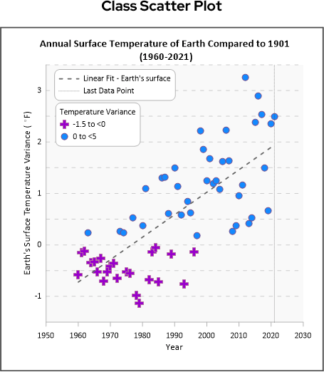
| The Class Scatter plot is created with the default settings. |
Set the class symbol and color
For this example we want the symbol to depend on if the temperature variance for that year is greater than or less than 0.
-
Click the Class Scatter plot to select it.
-
In the Property Manager, click the Plot tab to select it.
-
In the Data section, click the drop down next to the Class Variable field and select Column B: Earth's Surface
-
To set the definition and number of classes, go to the Plot Options section, and click the
 button in the Classes field.
 -
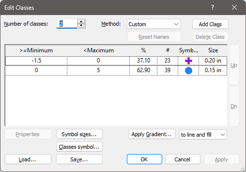
In the Edit Classes window, change the Number of Classes to 2.
-
In the Method field, click the drop down and select Custom.
-
Double click in the first line to open the Properties window for the first class.
-
Set the >= Minimum field to -1.5, the <Maximum field to 0, and the Size field to 0.2.
-
Click the
 button next to the Fill field to expand that section.
 -
In the Foreground Color field, click the drop down and select Purple.
-
Click OK.
-
Double click in the second line to open the Properties window for the second class.
-
Set the >= Minimum field to 0, the <Maximum field to 5, and the Size field to 0.15.
-
In the Symbol field, click the drop down and select Symbol 12 (filled circle).
-
Click the
button next to the Fill field to expand that section. -
In the Foreground Color field, click the drop down and select Dodger Blue.
-
In the Properties window, click OK
-
The Edit Classes window, should look like the image below.
-
In the Edit Classes window, click OK.
Adjust the Y axis properties and title
-
In the Object Manager , click the Y axis, Y Axis 1.
-
In the Property Manager, click the Axis tab.
-
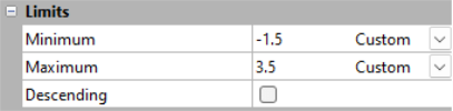
In the Limits section click the Minimum drop down and select Custom.
-
In the Limits section click the Maximum drop down and select Custom.
-
In the Title section, click the Text Editor button [
 ] in the Text field.
 -
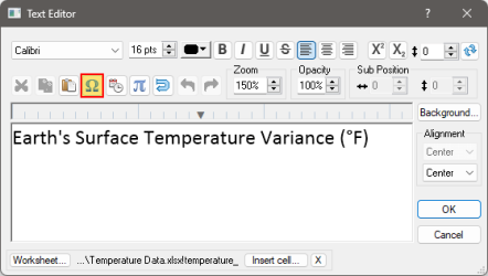
In the Text Editor window delete the current text and enter "Earth's Surface Temperature Variance (F)".
-
To add the degree symbol place the cursor in front of the "F", then click the Insert Symbol button,
 .
.-
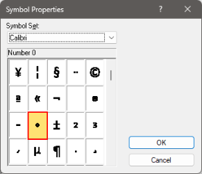
In the Symbol Properties window, click in the Symbol Set field and select Calibri from the list of fonts.
-
Scroll down 4 lines past the lower case z to find the degree symbol, select it then click OK.
-
Click OK to close the Text Editor window.
-
Golden Nugget : Graph and axes titles can use linked text so that the information is updated on the graph any time the information changes in the cell in the data file. Other linked text options include the file name, fit statistics, and date/time formats.
Adjust the X axis properties and title
-
In the Object Manager , click the X axis, X Axis 1.
-
In the Property Manager, click the Axis tab.
-
In the Limits section click the Minimum drop down and select Custom.
-
In the Limits section click the Maximum drop down and select Custom.

-
In the Title section, click the Text Editor button [
] in the Text field. -
In the Text Editor window delete the current text and enter "Year".
Change the Graph title
-
In the Object Manager, click the graph, Graph 1.
-
In the Property Manager, click the Title tab.
-
In the Title Properties section, next to the text field click the Text Editor button,
. -
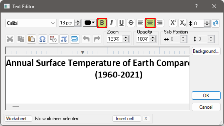
In the Text Editor window delete the current text and enter "Annual Surface Temperature of Earth Compared to 1901 (1960-2021)".
-
To change the text formatting place the cursor in front of the "(" and press ENTER.
-
Select all of the text then press the Center Text and Bold buttons to change the font properties, then press OK.
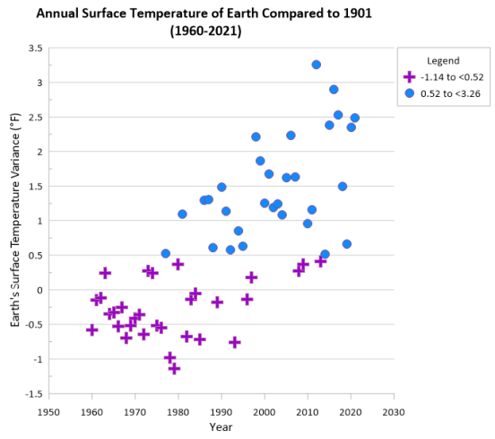
After completing the steps above your graph will look like the image below.
Now let's take this classed scatter plot and transform it into a stunning visual that is sure to make your data easier to understand and present to your stakeholders.
Let's start by adding some horizontal and vertical lines ....

|
|

|