Create and Run Your First Automation Script
Start Recording
To start recording, Click the Automation | Scripts | Record command.
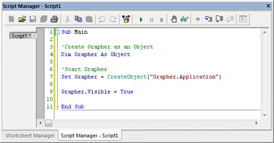
The Record button changes to Stop Recording to indicate that the script is recording. Information appears in the Script Manager as soon as recording begins. This code starts Grapher when the script is run later. Every action taken will be recorded in the script manager, until the recording is stopped.
|
|
|
Code is immediately added to the Script Manager when script recording begins. This information starts Grapher when the script is run later. The text in green with an apostrophe prefix are comments. |
Create a scatter plot
-
Click the File | New | Plot command.
-
Click the Home | New Graph | Line/Scatter | Scatter Plot command.
-
The Open Worksheet dialog appears. Browse to Grapher's Samples folder. The location of this folder varies depending on where the software was installed. If the software was installed in the default folder, the path is C:\Program Files\Golden Software\Grapher\Samples.
-
Click Open to create the default graph and scatter plot.
A scatter plot is created with the first two available columns using the default properties. Grapher can create graphs from data containing date/time information. In this example, column A contains dates, so dates are plotted on the X axis.

|
|
The graph is created with the default properties. |
Changing the X Axis Date/Time Tick Mark Spacing
Tick marks can be spaced at any desired interval. Tick marks can be changed to show one tick mark every X number of units or can be based on date/time units, such as minutes, days, months, or years. To set the tick marks to display one tick and label per month:
-
Click on the X Axis 1 in the Object Manager to select it.
-
In the Property Manager, click on the Ticks tab to display the tick mark properties.
-
Click the
 to the left of the Major Ticks
section to expand the major tick options, if necessary.
to the left of the Major Ticks
section to expand the major tick options, if necessary. -
Check the box next to the Use date/time spacing option in the Major Ticks section.
-
Next to Date/time spacing, click Every Year to open the Date/Time Spacing dialog.
-
Change Year to Month and click OK.
The X Axis major tick marks are now displayed at 1/1/09, 2/1/09, 3/1/09, and 4/1/09.
|
|
|
The X Axis tick mark spacing can be based on date/time units. |

Changing the X Axis Date/Time Tick Label Format
There are a variety of tick label formatting options available. One of the options is to change the display of the date/time labels. There are many different predefined date/time labels available or you can create your own custom label format. To change the major label format from M/d/yy (1/1/2009) to MMM-yy (Jan-09):
-
Click on the X Axis 1 in the Object Manager to select it.
-
In the Property Manager, click on the Labels tab to display the tick label properties.
-
Click the
to the left of the General
section to expand the major label options, if necessary. -
Click the Select button next to Major label date/time format to open the Date/Time Format Builder dialog.
-
Type MMM-yy in the Date/Time format (edit to change) field.
-
Click OK.
The X Axis tick labels are displayed in the MMM-yy format. The month abbreviations are determined by your PC's default language setting. You can force a specific language for date/time labels by adding a language identifier before the date/time format.
|
|
|
The X Axis date/time labels can be formatted with a predefined or custom format. |

Adding a Fit Curve
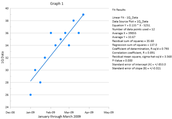
Grapher includes many predefined fit curves as well as a tool for creating custom fit curves. XY and histogram data can be fitted, and statistical information can be displayed for the fit curves in the plot or in a report. To add a fit curve,
-
Click 1Q_Data in the Object Manager to select the scatter plot.
-
Click the Graph Tools | Add to Graph | Fit Curve command. A linear fit is added by default.
-
Click Linear Fit - 1Q_Data in the Object Manager to select the fit curve.
-
Click the Plot tab in the Property Manager to display the fit curve properties.
-
Set the Significant digits property to 4.
-
Click Insert next to the Insert into plot document field to add a table of fit statistics to the plot window. The cursor changes to a cross-hair to indicate draw mode.
-
Click the position in the plot window where you want to add the fit statistics.
Now a linear fit curve and various fit statistics are displayed in the plot window.
|
|
|
Adding fit curves helps explore and understand possible relationships in the data. |
Stop Recording and Save Your Script
Now that the graph has been created, it is time to stop recording and save the script. To stop and save the script:
- Click the Automation | Scripts | Stop Recording command. The Save As dialog appears.
- Select a save location, such as your Documents folder, in the Save As dialog.
- Type tutorial script recorder into the File name box.
- Click the Save button.
- Right-click in the Script Manager and select File | Close to close the script in the Script Manager.
The recording is stopped and the tutorial script recorder.bas is saved for future use.
Running Your Script
To run a script in Scripter:
- Open Scripter by double-clicking the Scripter desktop icon or by clicking the Windows Start button and selecting Scripter from the Golden Software Grapher folder.
- Click the File | Open command and select tutorial script recorder.bas file from where it was saved.
- Click the Script | Run command to execute the script.
Congratulations, you have completed and run your first script!
Use the Advanced Lessons button to choose to go over another advanced lesson now, or click Next for more resources with automation.

|
|

|