Plot Page - Q-Q and Normal Q-Q Plots
The Q-Q and normal Q-Q plot properties Plot page contains the options to change the data file and axes; set data used in the plot; set the interpolation factor; and create fit curves in the plot. To view and edit Q-Q plot properties, click on the Q-Q plot in the plot window or Object Manager to select it. Then, click on the Plot tab in the Property Manager. The properties available will be specific to the type of plot.
Click one of the Plot page section names in the list below to read more information about the properties in those sections or follow this help topic sequentially to read about each property.
NOTE: Click the Graph Tools | Add to Graph | Fit Curve command to add a fit curve to the graph. This adds a linear fit by default. Many fit types are available.
|
|
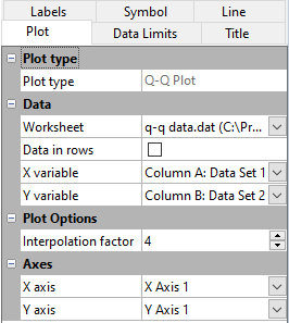
|
Example Q-Q and Normal Q-Q Plot properties page |
Plot Type
The Plot type property displays the type of plot.
Data
Worksheet
Click the existing data file path and file name next to Worksheet to select a different data file for the plot. Click on a currently open worksheet or click the Browse option to navigate to a worksheet that is not yet open. Select a different data file in the Open Worksheet dialog, and click the Open button to change the data. The plot automatically updates.
NOTE: The worksheet columns are retained after changing the worksheet. If any of the column options are blank after changing the Worksheet, click on the blank option and select the desired column. A blank next to column means that the column does not exist in the new worksheet.
Data in Rows
Select the Data in rows option if your data file is formatted where each row includes one variable. When the Data in rows option is selected, all plot properties that require data values are specified by selecting a data row. This includes variables such as X and Y, data labels, worksheet ranges, etc. Properties that list column letters will update to list row numbers. When switching from plotting data in columns to plotting data in rows, Grapher may not be able to select the correct rows automatically. Verify the correct rows are selected.
The property descriptions below refer to data columns, but when Data in rows is selected the property lists will include rows.
Variables
Click on the column name next to the X variable or Y variable fields to change the columns used to create the plot. In the list that appears, select the new column. If the first worksheet row contains header information, the header information appears next to the column letter.
Aside from the columns containing data there are three other options: row number, sequence number, and None. These options are available in the list that appears before the first column.
- Selecting the Row number option plots the axis with the row numbers used in the Worksheet rows section. For example, if the first row is number two, the axis begins at a value of two.
- The Sequence number option plots the data according to the total number of rows used. The sequence number always begins with the number one regardless of which rows are selected in the Worksheet rows group. Blank lines between rows are ignored when calculating the value. The sequence number increments by one when rows are adjacent or when rows are skipped.
- None sets the column to the normal distribution. To compare a single data column against a normal distribution, select None for one of the columns.
When changing the X variable, Y variable, or Z variable to date/time data from numeric data, the Use date/time format option for the corresponding axis Tick Labels will automatically be checked to match the new data. When changing the X variable, Y variable, or Z variable to numeric data from date/time data, the Use date/time format option for the corresponding axis Tick Labels will automatically be unchecked to match the new data.
NOTE: The worksheet columns are retained after changing the worksheet. If any of the column options are blank after changing the Worksheet, click on the blank option and select the desired column. A blank next to column means that the column does not exist in the new worksheet.
Plot Options
Interpolation Factor
The Interpolation factor controls the degree of the polynomial fit used to calculate the percentiles for the data points. This is used when the two data sets being compared contain a different number of unique points. The larger the Interpolation factor is, the more variation in the curve required to fit the data. Normally, a smaller value, such as the default 3, will give a closer match of where each point in the data set should be plotted and will give a better estimate of the actual percentile value. Values range from 1 to 10.
Axes
Click on the axis name next to the X axis, or Y axis fields to change the axes used for the plot. Select another axis name from the list. Alternatively, click Select plots/axis to change the axis used by several plots on a graph at once. See the Axis - Add to Graph help topic for information about how to add a new axis to the graph. Once the new axis is added to the graph, it will be available in the X axis, or Y axis lists.