Pie Charts
|
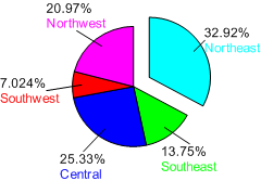
Click the Home | New Graph | Statistical | Pie Chart command to display data as proportional slices of a circle. Each data value is divided by the sum of all the data to determine the size of the slice. The data with the largest proportions appear as the largest slices. All data for a pie chart must be in a single column for data and an optional single column for labels. After being created, pie charts contain each row as a separate slice of the pie. The pie chart is automatically labeled with two labels. The top label is the text in the worksheet's label column. The second label is the percentage of the pie or data value for that slice. Either label can be altered to display data value, as well. Click the Pie Chart button to create a pie chart. |
|

|
| Pie charts show data as proportions of a circle. |
Creating a New Pie Chart
To create a pie chart:
- Click the Home | New Graph | Statistical | Pie Chart command.
- Select a data file in the Open Worksheet dialog. You can select a new data file or you can select an open data file in the Open worksheets section.
- Click the Open button. A pie chart is created using the default properties.
Editing Pie Chart Properties
To change the features of a pie chart— including the columns used to create the chart— first select the chart in the plot window or Object Manager and then edit its properties in the Property Manager.
Click the following tabs in the Property Manager to change different properties:
