Graph Page - Radar Plot
The Graph page of the Property Manager sets the graph properties for radar plots. To view the properties on the Graph tab, click on the Graph object in the Object Manager. In the Property Manager, click on the Graph tab.
|
|
|
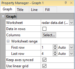
The Graph tab for a selected radar plot graph contains options for setting the radar graph properties. |
Worksheet
Click the existing data file path and file name next to Worksheet to select a different data file for the plot. Click on a currently open worksheet or click the Browse option to navigate to a worksheet that is not yet open. Select a different data file in the Open Worksheet dialog, and click the Open button to change the data. The plot automatically updates.
Data in Rows
Select the Data in rows option if your data file is formatted where each row includes one variable. When the Data in rows option is selected, all plot properties that require data values are specified by selecting a data row. This includes variables such as X and Y, data labels, worksheet ranges, etc. Properties that list column letters will update to list row numbers. When switching from plotting data in columns to plotting data in rows, Grapher may not be able to select the correct rows automatically. Verify the correct rows are selected.
The property descriptions below refer to data columns, but when Data in rows is selected the property lists will include rows.
Columns
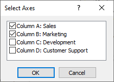
Click the Select button next to Columns to open the Select Axes dialog. In the dialog, a list of available columns in the selected worksheet are displayed. A check mark next to a column indicates the column of data will be used in the plot. To add a column, click in the box to the left of the column name. A check mark will be added to the box. To remove a column, click in the box to the left of the column name. The check mark will be removed. When finished selecting all columns, click OK to make the change active. Click Cancel to return to Property Manager with the previous column list.
|
|
|
In this example, columns A and B are included in the radar plot. Columns C and D are not. |
Worksheet Range
To select the range of rows to plot in the Worksheet
range section, first click the ![]() next to Worksheet rows to open the section. The default
rows are the first and last rows in the worksheet that contain data.
next to Worksheet rows to open the section. The default
rows are the first and last rows in the worksheet that contain data.
If Auto is selected for the First row and Last row, all of the rows containing data are used. To limit the range of the plotted data, can change the range of rows by selecting Custom. You can then enter a new row number into the First row and Last row boxes. Select Auto to revert back to automatic row selection.
Keep Axes Synched
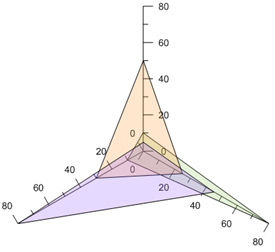
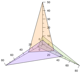
Check the box next to the Keep axes synched option to synchronize the radar plot axes. This means that changes made to one axis will update all axes. If the box is not checked, then the axes are not synchronized. This means that changes made to one axis will only update the selected axis. Using synched axes often makes visual comparison between variables easier. You can immediately see in the graph below that the variable pointing directly up does not have as much affect as the other two variables when the axes are synched.
|
|
|
|
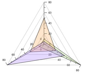
This radar plot contains synched axes. All axes go from zero to 80 units. |
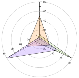
This radar plot does not contain synched axes. The upper axis does not have the same extents as the other two axes. |
Use Linear Grid
Check the Use linear grid option to create linear grid lines when the axis grid lines are on. Clear the box next to the Use linear grid option to create circular grid lines when the axis grid lines are on.
To turn on axis grid lines, click on a radar axis to select it. Click on the Line tab in the Property Manager. Check the box next to the Major tick grid line option, Minor tick grid line option, or Worksheet grid line option.
|
|
|
|
This radar plot uses a linear grid. Grid lines directly connect axes with straight lines. |
This radar plot does not use a linear grid. Grid lines connect axes with curved lines, similar to the angle axis. |